

Color can make or break any artistic project. It doesn't matter if you're painting your house, knitting a scarf, or beading a bracelet-- color is the first thing most people notice, and if the colors you choose "work" for the project, the effect is profoundly positive. If, however, you choose colors that don't "work"-- either they don't work together, or they don't match the project-- they can get in the way of the artistic statement you are trying to make.
I'm not trying to say that every color needs to harmonize perfectly-- trust me, I'm all about using bright and unexpected color combinations-- but I think it's important to understand the way that color works (and, more importantly, the way colors work together) if you want to make the most out of crafting.
Part One: Colors on Their Own
Every color has four components. Depending on your source, you'll hear these components referred to by different names, but I'm going to go with the fairly standard Hue, Value, Saturation, and Warmth.
Hue: Hue is what most people think of when they think of color. A color's hue is where it falls on the color wheel, or on the spectrum: some examples of hues are blue, orange, red, yellow-green, and red-violet.
Value: Value is how light or dark a color is. If a color is very pale, it's high value-- if it's very dark, it's low value. Value ranges all the way from white to black, with every color in the rainbow found somewhere in the middle.
Saturation: Saturation measures a color's purity. If the color is pure-- for example, the reddest red you can imagine-- then it has high saturation. If a color is muddy or grayed out, then it has low saturation.
Warmth: Warmth is sorta an offshoot of Hue. There are warm colors and there are cool colors. Generally, yellow-greens, yellows, yellow-oranges, oranges, red-oranges, and pure reds are warm, while red-violets, violets, blues, blue-violets, and blue-violets are cool. The most interesting thing about warmth is that the warmer colors advance (that is, appear to come towards us) and the cooler colors recede (that is, appear to go away from us).
Part 2: Combining Colors
Now that we can understand and describe colors using the "terms of the trade", we can take a look at how to combine them in interesting ways. A lot of color combinations are easier to understand if you have use of a color wheel.
Now that we have all this theory, how do we go about applying it to crafts? In my experience there has always been one thing you have to do first:
Preliminary Step: Choose one color that you want or have to work with. This will be your "main color".
Let's say you've always thought your daughter would look adorable in a denim dress-- choose denim blue as your first color. If you want to knit a scarf and have way too much of one color of yarn-- start with that color, and go from there. Sometimes you don't have much of a choice: if you're decorating a Christmas tree, your main color is dark green (assuming you don't have a bright pink tinsel tree!).
The one suggestion I have is to start with a color that has a hue: for example, black won't really work with this system. If you need to start with black, white, or gray, please choose a second color that has a hue and use that as your main color.
Step One: Determine the hue of your "main color".
This isn't a science. In fact, even color theorists have arguments as to whether or not something is "green" or "yellow-green". Don't worry about it too much. Just take a look at the color wheel and figure out where your color might go. Forget about saturation and stuff for now.
Step Two: Pick out another hue (or two) that works with your first hue.
Easier said than done, right? Actually, this part's not so bad, if you use some Color Theory tricks. Due to science behind the ways our eyes perceive color, some hue combinations will always work. Let's take a look at them.
Analogous Colors:
These are colors that are next to one another on the color wheel. For example, red and orange. Blue and blue-green. Yellow and yellow-green. Hues next to one another are very similar, so they harmonize very well. You could even use several of them together, like red, red-orange, and orange.

Now that we can understand and describe colors using the "terms of the trade", we can take a look at how to combine them in interesting ways. A lot of color combinations are easier to understand if you have use of a color wheel.
 |
| A color wheel I just so happen to have created for this very purpose. |
Preliminary Step: Choose one color that you want or have to work with. This will be your "main color".
Let's say you've always thought your daughter would look adorable in a denim dress-- choose denim blue as your first color. If you want to knit a scarf and have way too much of one color of yarn-- start with that color, and go from there. Sometimes you don't have much of a choice: if you're decorating a Christmas tree, your main color is dark green (assuming you don't have a bright pink tinsel tree!).
The one suggestion I have is to start with a color that has a hue: for example, black won't really work with this system. If you need to start with black, white, or gray, please choose a second color that has a hue and use that as your main color.
Step One: Determine the hue of your "main color".
This isn't a science. In fact, even color theorists have arguments as to whether or not something is "green" or "yellow-green". Don't worry about it too much. Just take a look at the color wheel and figure out where your color might go. Forget about saturation and stuff for now.
Step Two: Pick out another hue (or two) that works with your first hue.
Easier said than done, right? Actually, this part's not so bad, if you use some Color Theory tricks. Due to science behind the ways our eyes perceive color, some hue combinations will always work. Let's take a look at them.
Analogous Colors:
These are colors that are next to one another on the color wheel. For example, red and orange. Blue and blue-green. Yellow and yellow-green. Hues next to one another are very similar, so they harmonize very well. You could even use several of them together, like red, red-orange, and orange.
Complimentary Colors:
Compliments are colors that are opposite one another on the color wheel. Blue and orange, red and green, and yellow-orange and blue-violet are some examples. These hues work together because they are so different from one another that they cause a sort of "visual vibration", making them both look brighter when placed next to one another.

Near-Complimentary Colors:
Near-compliments are similar to compliments. You use the color wheel and find the hue opposite your main color-- and then you choose a color one spot to the right or left of your color's compliment. For example, you could pair blue with yellow-orange, or red with blue-green.

Split Complimentary Colors:
This is a three-color grouping that is also related to using complimentary colors. You choose your main color, then find its compliment: and use both hues on either side of its compliment. One example would be orange, blue-green, and blue-violet. These are often very pretty color schemes.

Triadic Colors:
These are like complimentary colors, but instead of being opposite one another, they make an equilateral triangle (a triangle where all three sides are the same length) in the center of the color wheel. One example of a color triad is red, blue, and yellow-- another example is violet, green, and orange.

A Hue and An Achromatic Color:
This is a combination where you choose a color with no hue (like black, white, or gray) as your second color. These combinations are often very bold, but they work pretty well.

Step Three: Think about value and saturation.
So, by now you have chosen a "main color" and a "secondary hue" that goes with it. Perhaps you're thinking about violet and yellow. A bright violet and a sunny yellow may look very nice together-- but sometimes you want gentler, more sophisticated colors. This is where value and saturation come in.
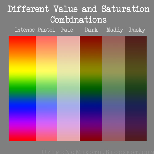
Let's take a look at some different saturation and value combinations.
High-saturation, middle-value: These are the colors on the color wheel. They're very intense, without being darkened or washed out. Let's go ahead and call these Intense colors.
High-saturation, high-value: These are like the colors on the color wheel, but with some white mixed in. They're still bright, but a little paler. These are usually called Pastel colors.
Low-saturation, high-value: These colors are kind of like washed-out pastels. Think antique lace, or old, barely-tinted furniture and photographs. I'm going to call these the Pale colors.
High-saturation, low-value: Add just a touch of black to the colors on the color wheel and you get these. They're still strong and vibrant, but they're a little darker. I'll call them Dark colors.
Low-saturation, middle-value: Add some gray to the colors on the color wheel and you get these. These colors have been heavily neutralized, and they're neither bright nor dark. I call this group the Muddy colors.
Low-saturation, low-value: These colors are both dark and muddy, as if you were looking at the color wheel on a dark and slightly misty night. I call these the Dusky colors.
Most colors that you run across will fit into one of these groups.
Determine which group your main color fits into. Again, it's not an exact science: just make a guess.
Now you have to figure out what group you want your secondary color to fit into. Sometimes it's not a choice: you want your secondary color to be blue, and you only have one ball of bright blue yarn, and the birthday party starts in an hour. When you do have the luxury of time and resources, you should think about how the value and saturation of your secondary color go with the value and saturation of your main color.
In general, colors of the same value/saturation type go well together. For example, a Dusky violet and a Dusky yellow look pretty good, if you're going for something dark and subdued. If you want to see how different value/saturation types look together, check out these charts, and see which combinations feel right for your situation.

(Complimentary Colors)

(Analogous Colors)
See all of the different combinations you can create using one single pair of hues? Crazy, isn't it?
Examples: Putting it all together
Here's are two examples of how to apply this method to crafting projects.


There you go! I hope this tutorial will help you feel a little more confident when choosing colors, and that it will help get you through those inevitable "aaaaagh, I want to make this, but I have no ideas what colors to use!" moments.
I hope you have a lot of fun playing with color!
Thank you somuch for a brilliantly clear tutorial- it will be invaluable! Will be following your blog in future!
ReplyDeleteHeather x
Ooh, thank you! I was a little worried I was being too... academic-y?... in my wording, so it's great to hear that it's clear and comprehensible. :D Thanks for the following, too!
DeleteGreat tutorial.Colour has always been a big problem for me.Will put this to good use!
ReplyDeleteThank you
Thank you very much! I hear that a lot from fellow crafters-- I think color is often put across as being a little "mysterious", which can make it very scary to use. I'm glad to know that these tips may help you out. :)
DeleteThis is an awesome tutorial!!!!! Thanks a lot!
ReplyDeleteNo problem! Glad to hear that it's helpful!
DeleteThis is a really impressive analysis! Thanks for the tutorial, gained my following ;-)
ReplyDeleteI'm so happy to hear that. I'm glad the tutorial was clear!
DeleteThank you for the kind comment. :D
Excellent information. Thanks.
ReplyDelete